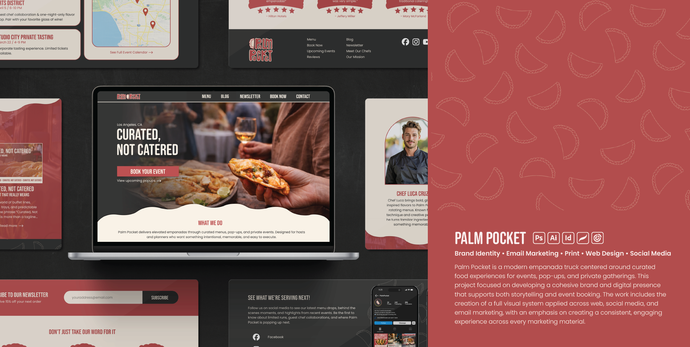

Brand Identity • Email Marketing • Print • Web Design • Social Media
Palm Pocket is a modern empanada truck centered around curated food experiences for events, pop-ups, and private gatherings. This project focused on developing a cohesive brand and digital presence that supports both storytelling and event booking. The work includes the creation of a full visual system applied across web, social media, and email marketing, with an emphasis on creating a consistent, engaging experience across every marketing material.

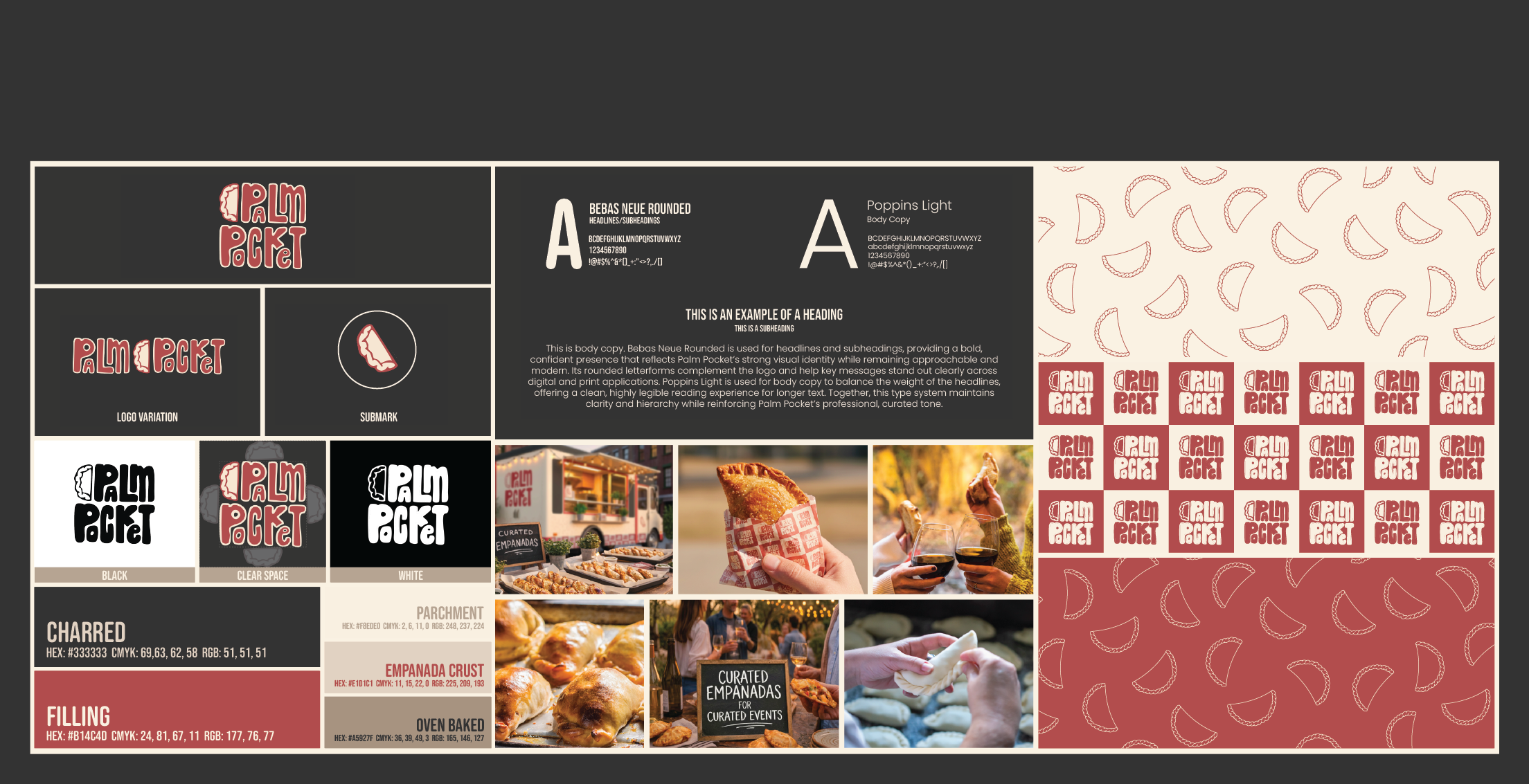
Style Guide
The brand identity was designed to feel bold, playful, and easily recognizable. I developed a custom logo, submark, and illustrated elements inspired by the shape and texture of empanadas. A warm, food-inspired color palette paired with rounded, expressive typography creates a friendly and inviting tone while maintaining strong visual consistency. Through this process, I learned how thoughtful visual systems can balance personality with clarity to create a memorable and cohesive brand.

Social Media

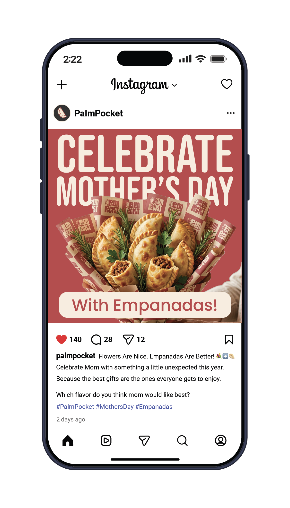
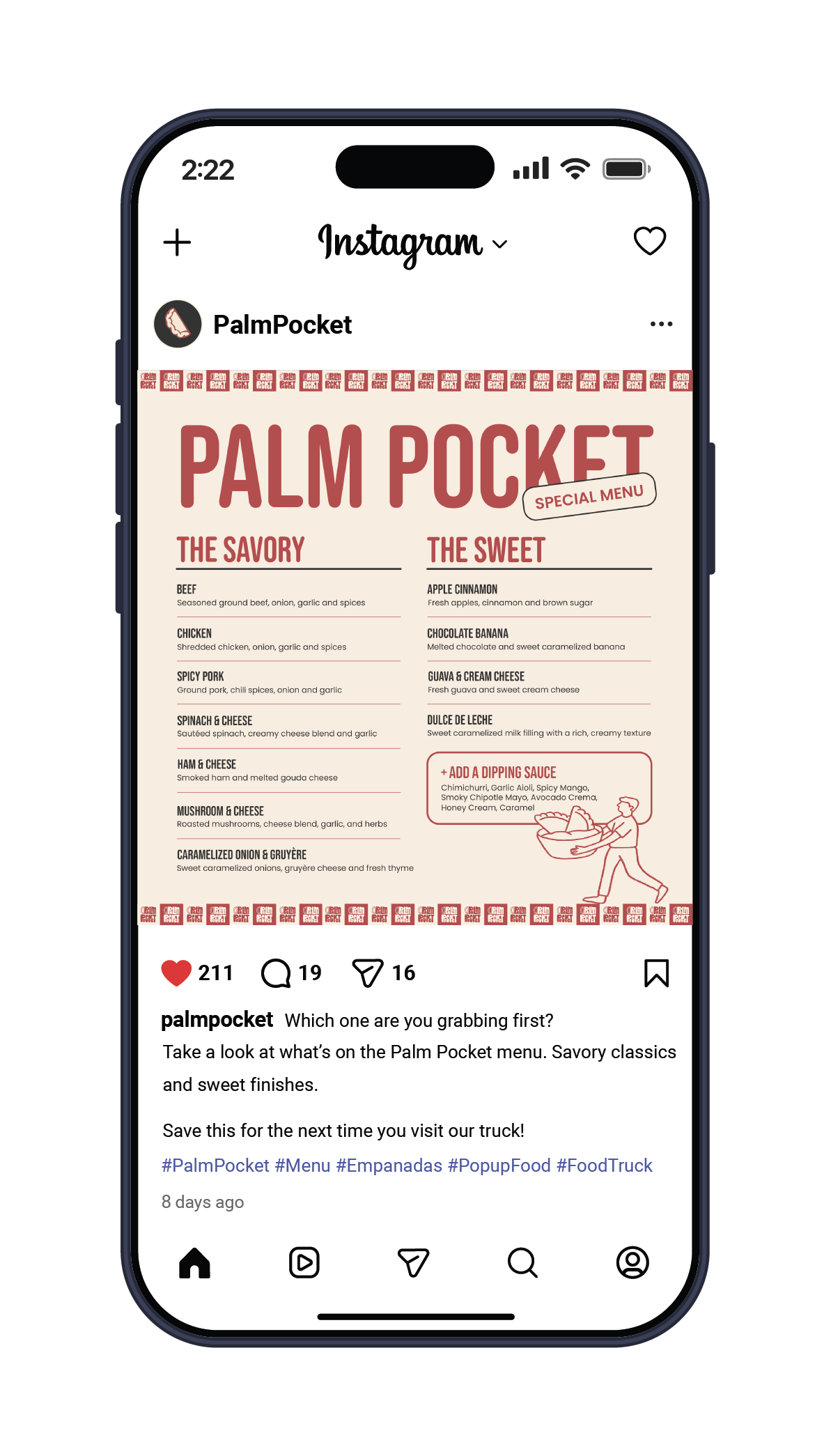
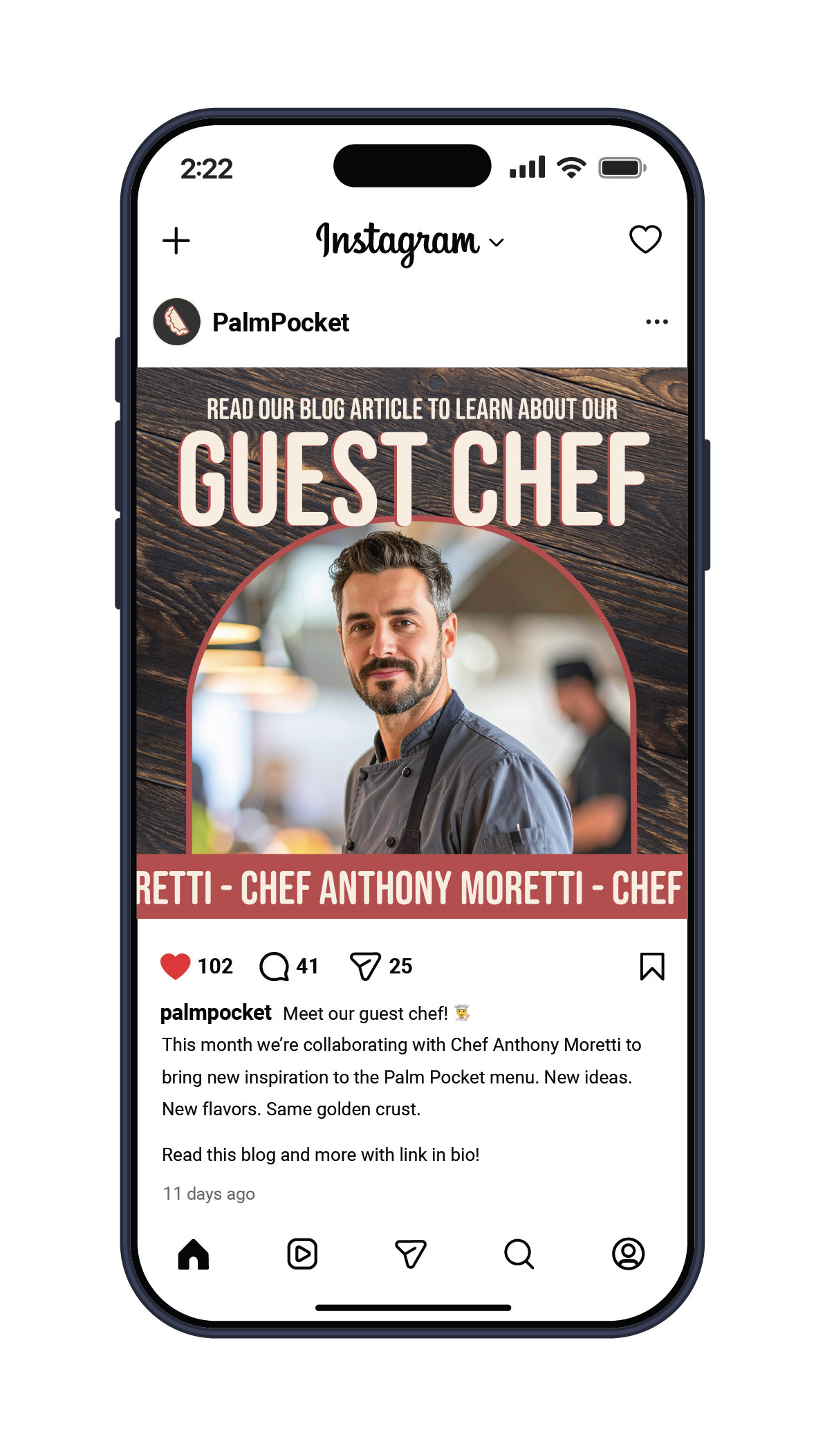
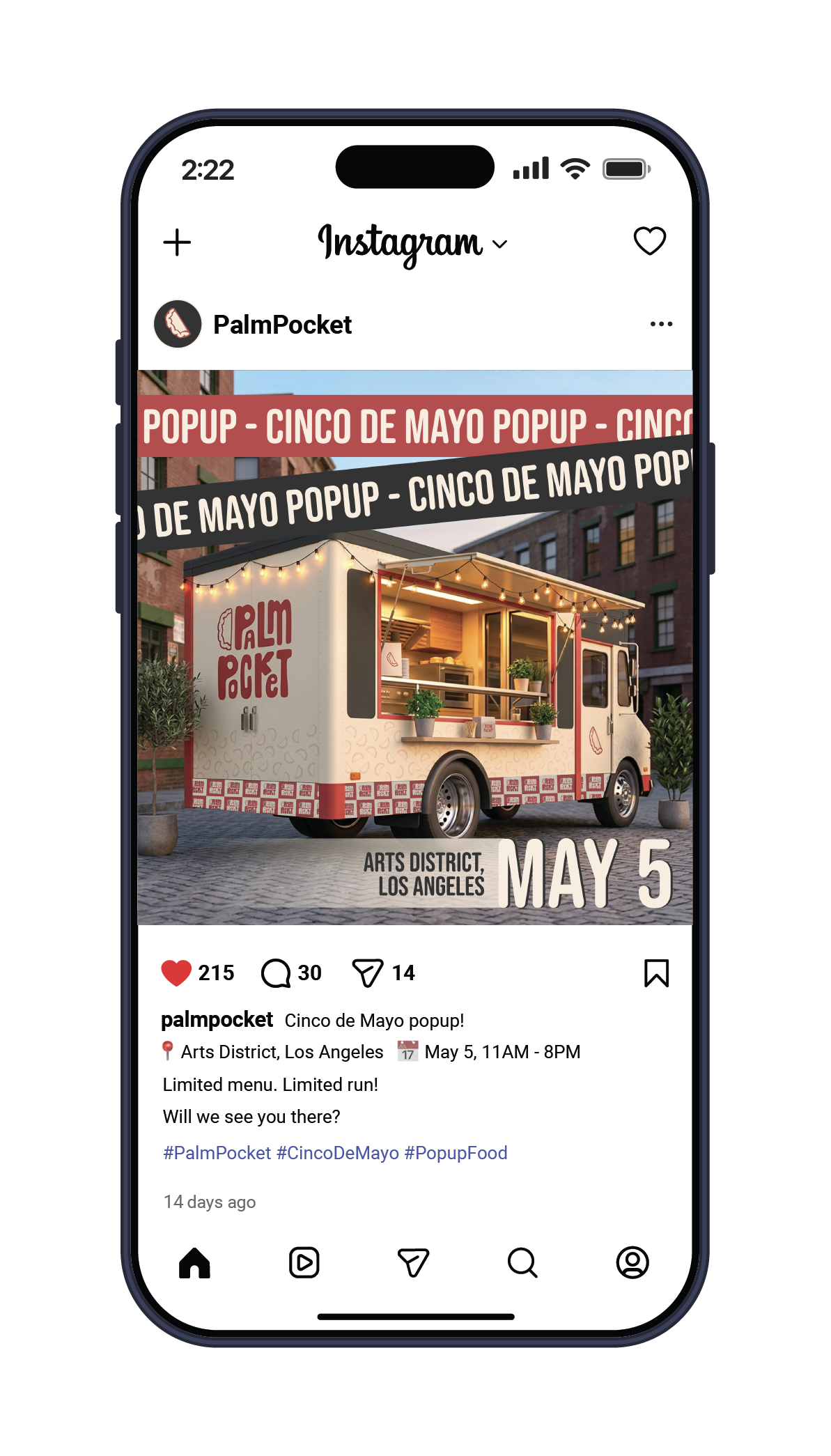
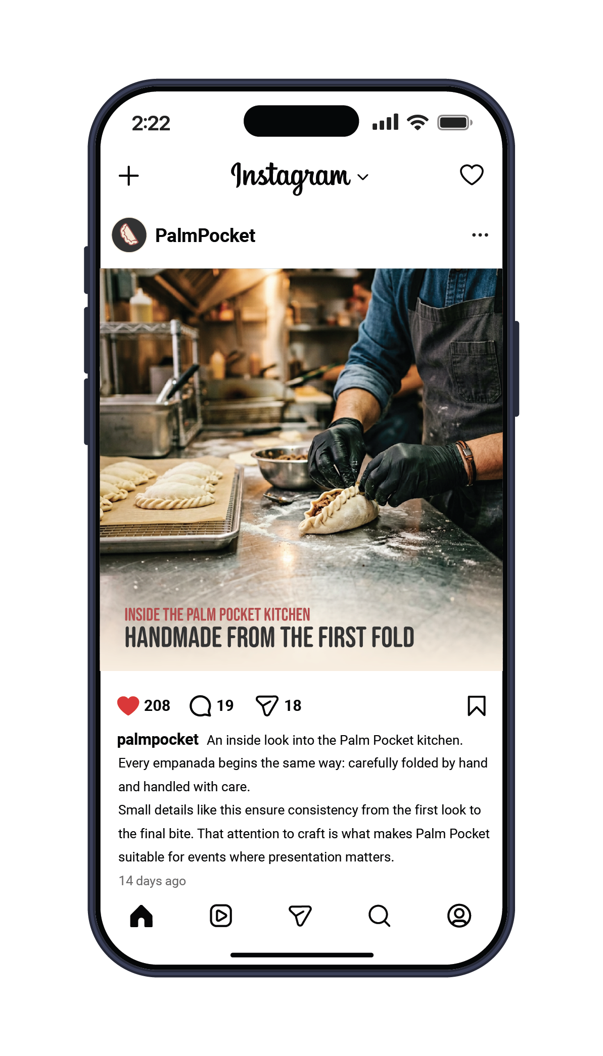
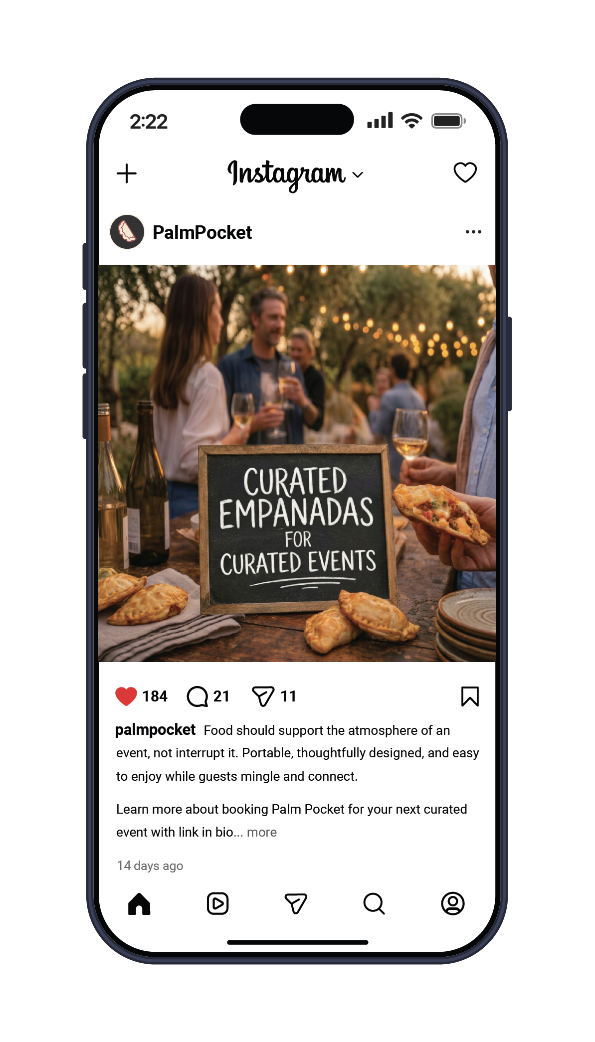
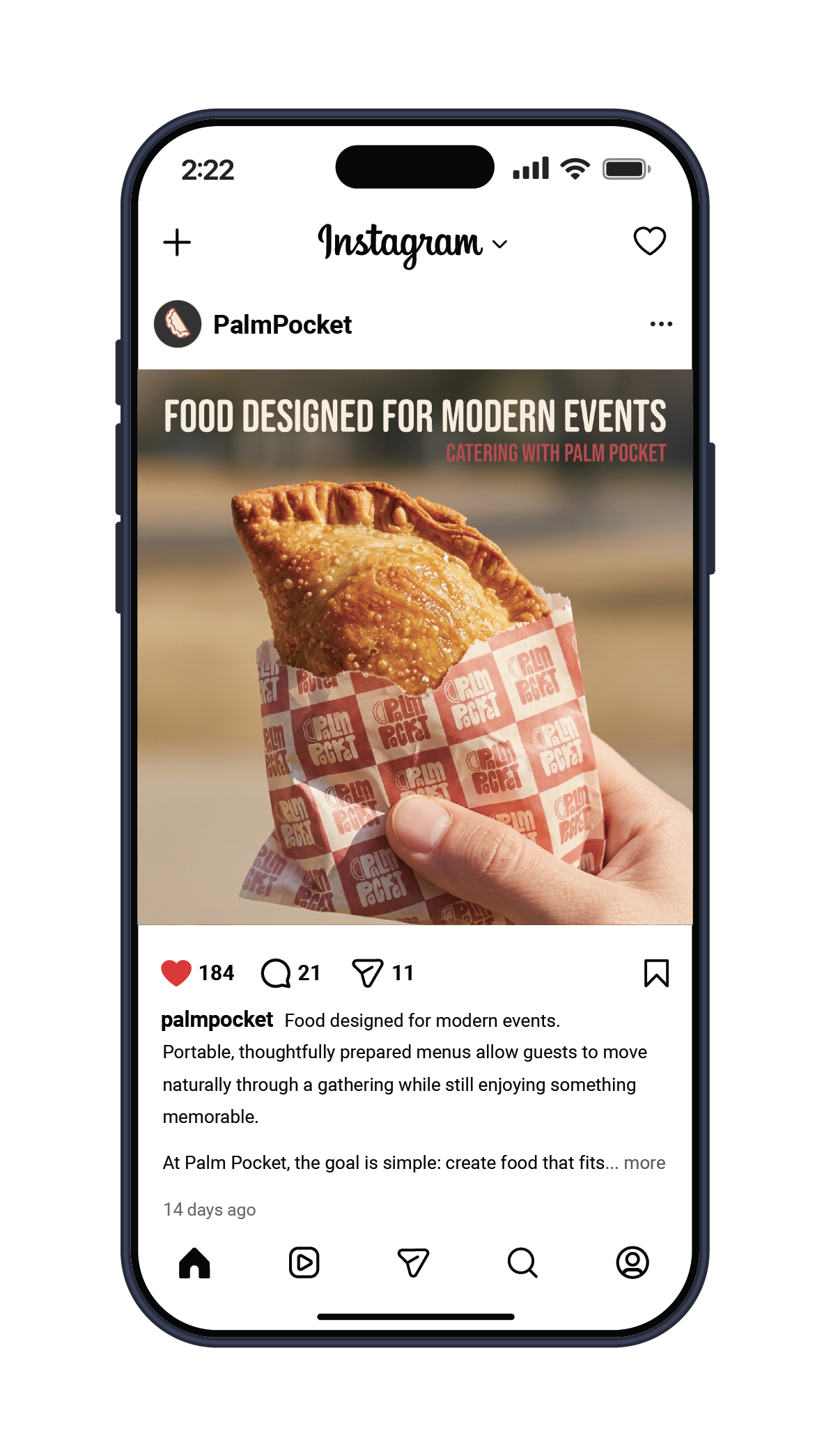

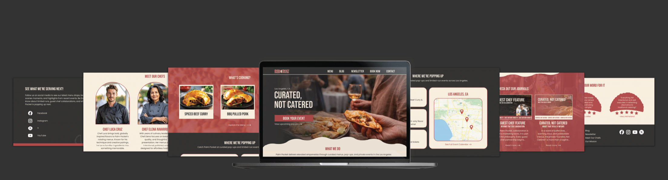
A cohesive social media system was developed to highlight events, menu features, and promotions while building strong brand recognition. I focused on creating visually consistent, engaging content that aligns with the brand’s tone across platforms. This reinforced how strategic design and consistency can strengthen audience connection and support overall marketing goals.

Blog Articles
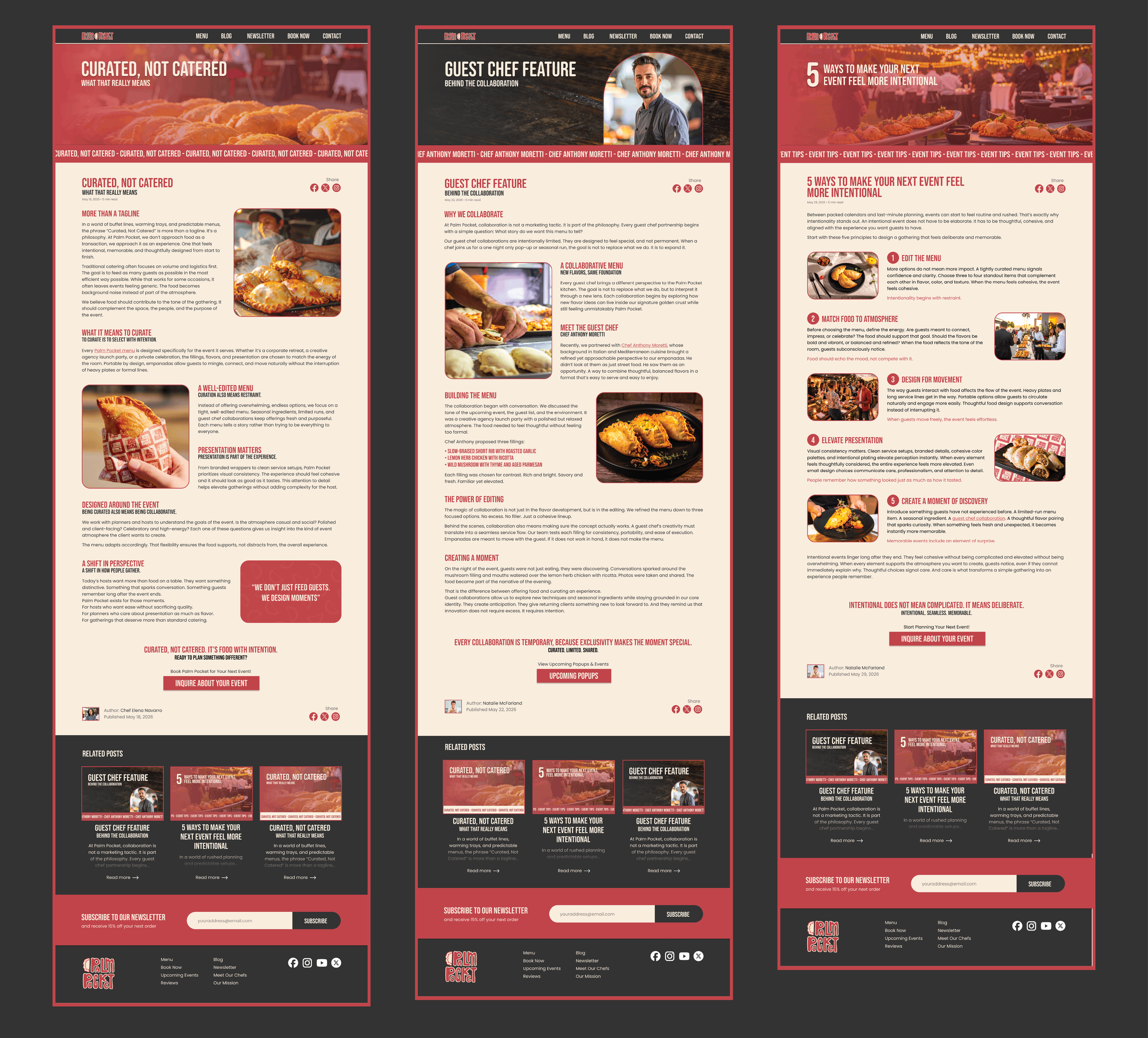
The blog expands Palm Pocket beyond the menu, offering event inspiration, behind-the-scenes content, and curated ideas. Each article uses thoughtful hierarchy, strong visuals, and scannable layouts to create an engaging reading experience. Designing these pages helped me explore how content structure and visual rhythm can keep users engaged while supporting the brand’s voice.

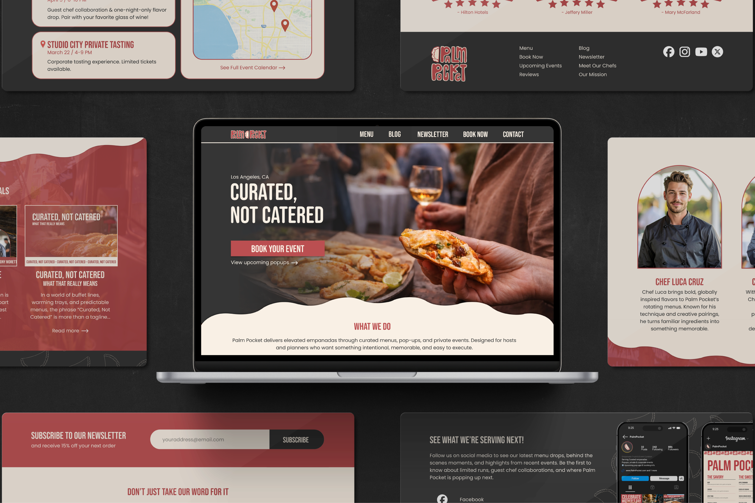
Website

Scroll the Figma link below:
The website was designed to support both brand storytelling and event bookings. I focused on creating a clear user flow that highlights services, upcoming pop-ups, and featured content. The layout combines strong imagery, bold headlines, and structured sections to balance personality with usability across desktop and mobile. This project strengthened my understanding of how layout and hierarchy guide user behavior and improve overall experience.

View More Work:

-
![]()
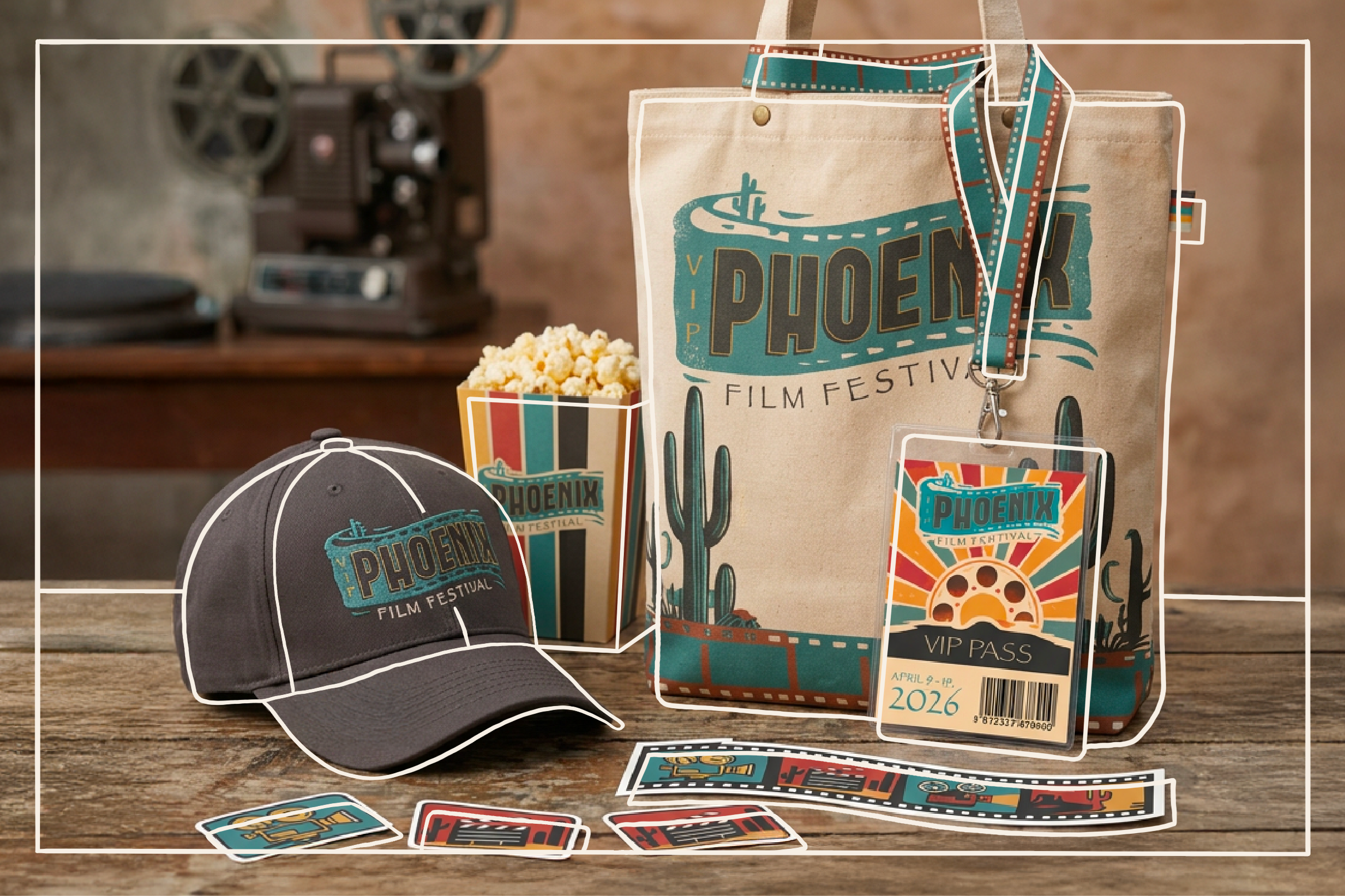
Phoenix Film Festival
Brand Identity • Poster Design • Event Collateral • Merchandise • Social Media
-
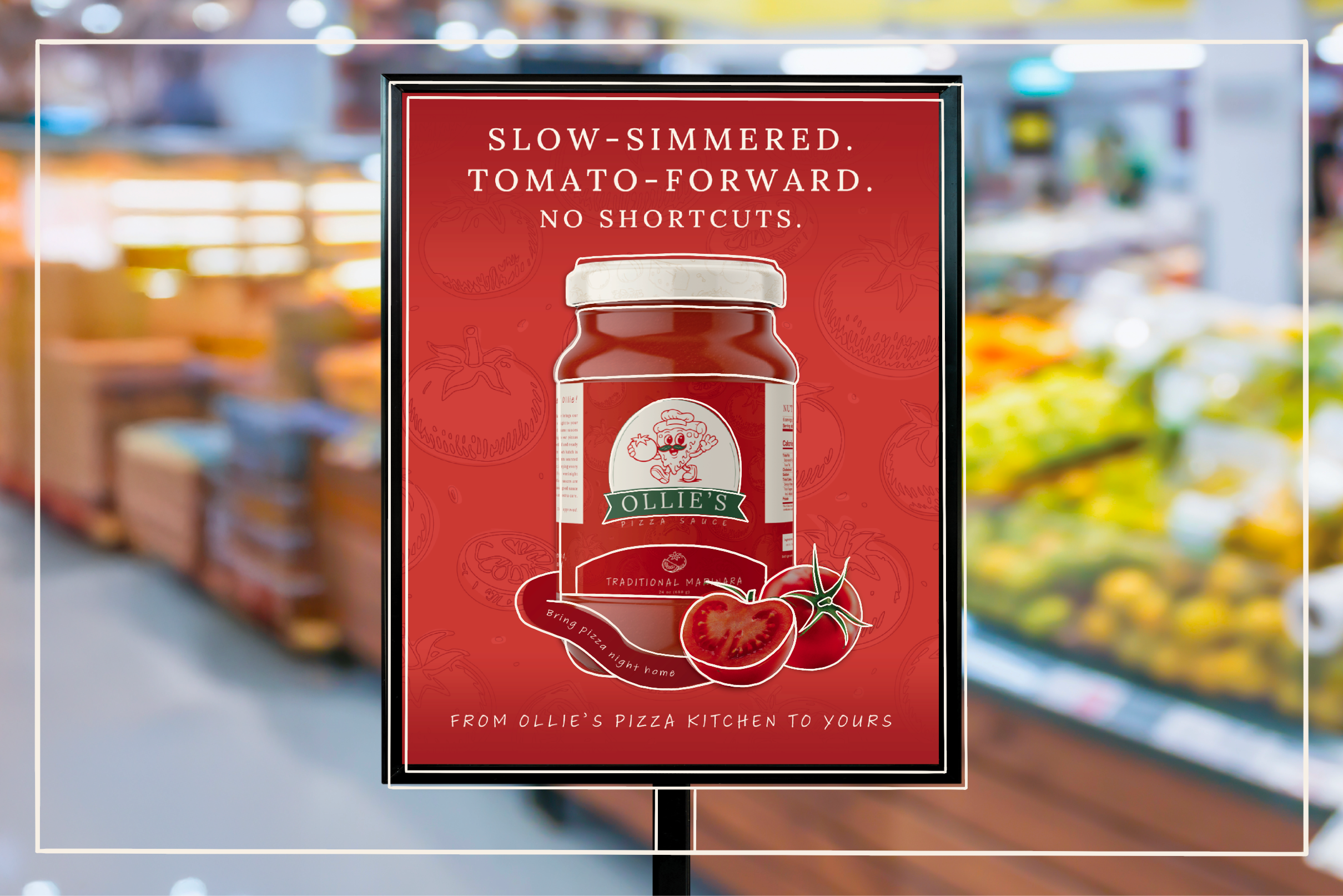
![Sign with Ollie's Pizza Sauce]()
Ollie's Pizza Sauce
Brand Identity • Packaging • Illustration • Print Advertisements
-
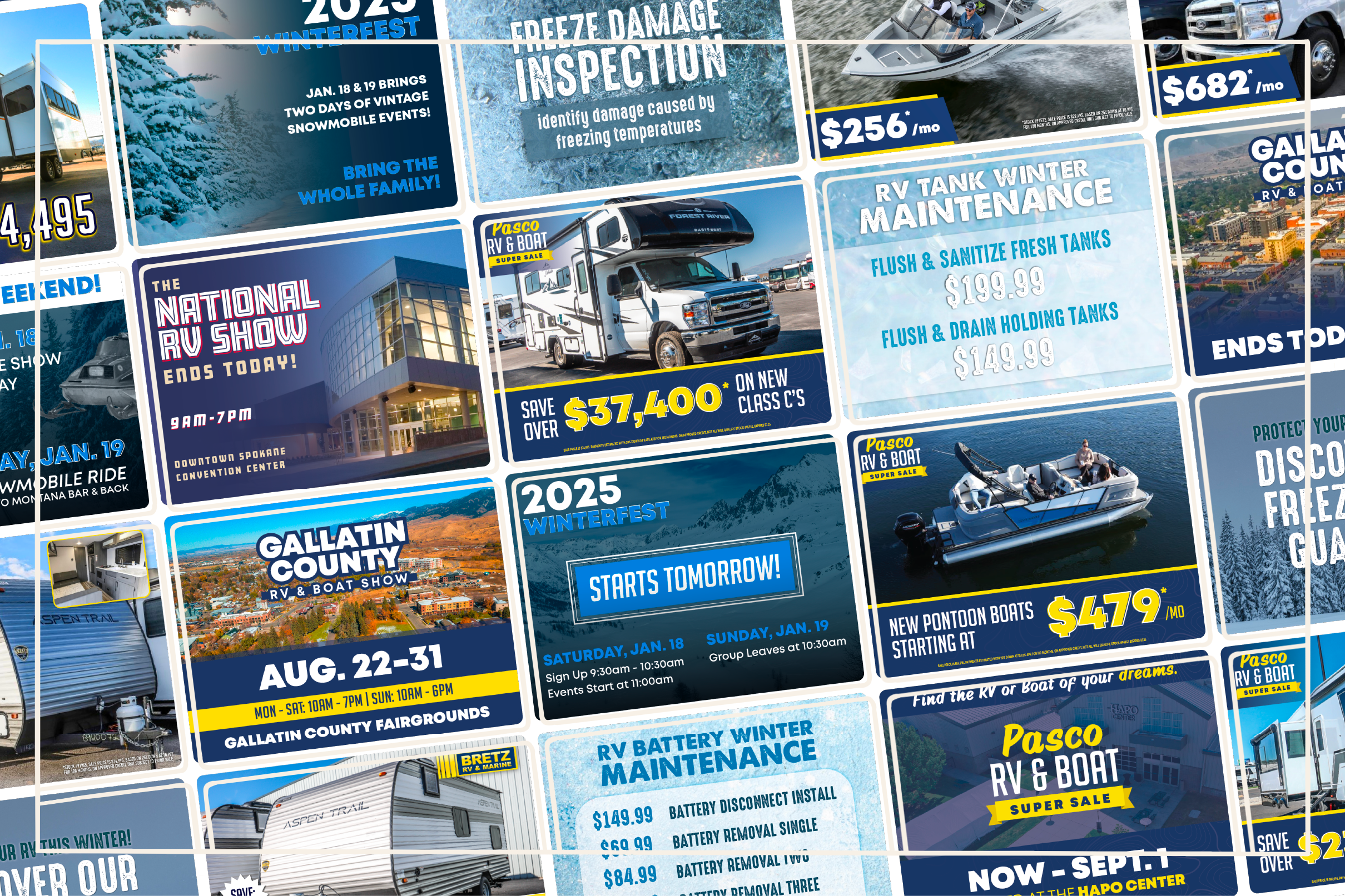
![]()
Bretz RV & Marine
Email Marketing • Social Media
-
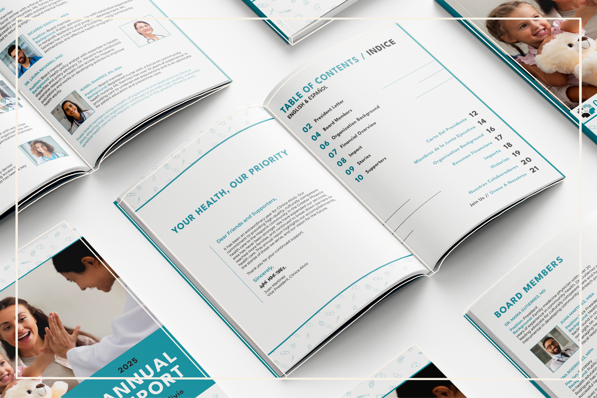
![Clinica Alivio Annual Report Book]()
Clinica Alivio
Brand Identity • Out-of-Home Advertising • Print
-
![An image of The Cultural Center.]()
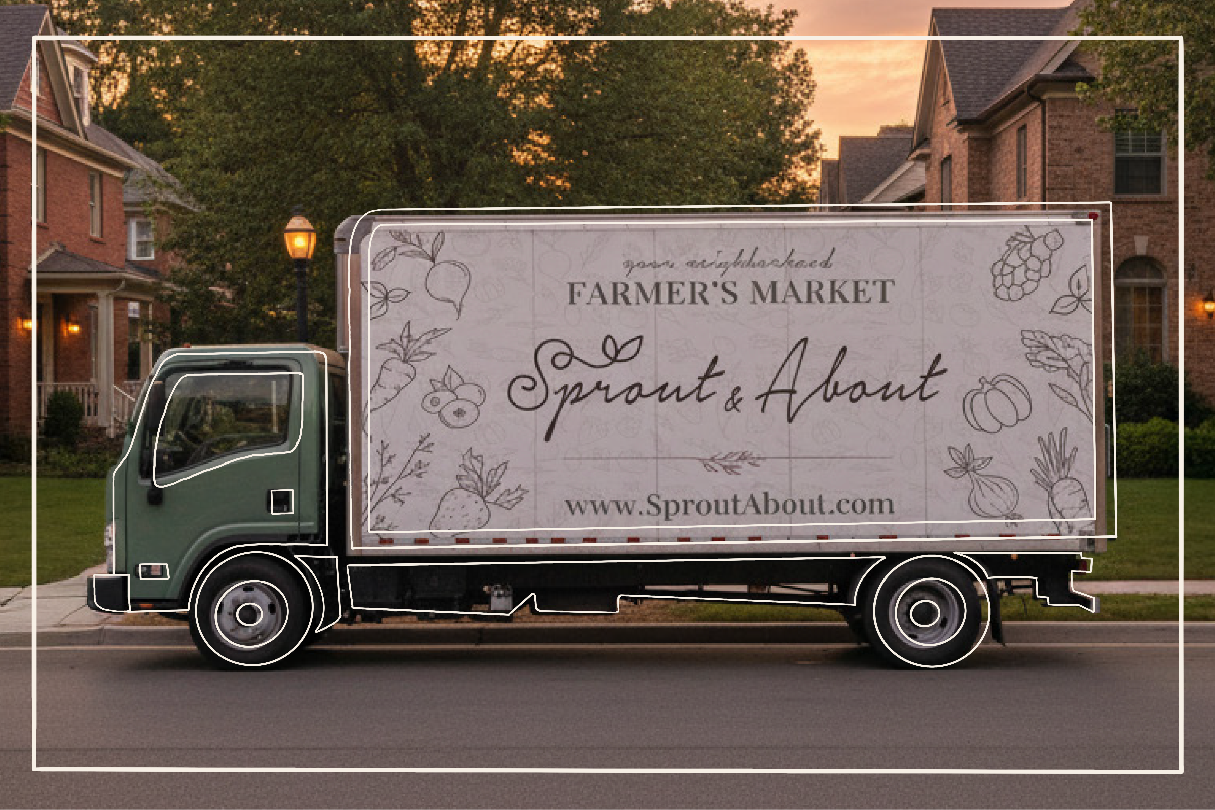
Sprout & About
Brand Identity • Packaging • Website Design • Social Media Campaign